
This is probably the most exciting thing I have read related to COVID in some time.
This from the NYT
“Kinsa’s thermometers upload the user’s temperature readings to a centralized database; the data enable the company to track fevers across the United States.
Owners of Kinsa’s thermometers can type other symptoms into a cellphone app after taking their temperature. The app offers basic advice on whether they should seek medical attention.
Kinsa has more than one million thermometers in circulation and has been getting up to 162,000 daily temperature readings since Covid-19 began spreading in the country.”
The technology was first published in 2018 and used to track annual influenza outbreaks:
A Smartphone-Driven Thermometer Application for Real-time Population– and Individual-Level Influenza Surveillance. Miller AC1, Singh I2, Koehler E2, Polgreen PM3.
Now Kinsa is tracking spikes of “atypical fever”, fever that does not follow the historical flu patterns and was not predicted:

Note the red part of the curve (March 9-20) did not follow the predicted patterns, and was perhaps due to COVID-19 , designated “atypical”. Very interesting is the dip (orange) that follows after March 20 to levels below “2% ill”. This dip in the curve is being attributed to effective social distancing measures. It would be the first measure of the effectiveness of such regulations and it certainly would help guide public policy.
Especially interesting are the interactive maps on the Kinsa website:
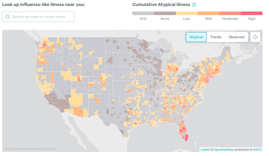
The above map shows the location of “atypical” illness (presumed COVID-19). It is the “amount of unexpected illness expressed as additional share of the population affected by influenza like illness above the expected values”
Note the concentration in Florida. That is fascinating because the RT-PCR testing for the coronavirus has not yet really shown the expected rise in cases (Florida ranks #6):

I presume the Kinsa technology is much faster at detecting trends, than counting positive cases and deaths. I am thinking that most of those people that are having atypical fevers have not yet been tested for the virus of they are waiting for a result. (Some people that I know well have been waiting for 9 days or more.)
This map is fascinating too: it depicts trends. By placing the cursor over your county, you can get very local data:

This is a 7 day rolling average of change in the illness level expressed as percent change up or down.
In Suffolk County, NY, the illness (atypical fevers) trend is decreasing by 4.3% and thankfully the decreasing trend is seen across the country. There is only one county in Texas (Hardeman Cty) where the trend is not decreasing.

This map (above) shows you how much influenza-like illness is being detected throughout the country. It is a map of how severely the population is being affected by atypical influenza like disease. I presume this data lags the data in the above graph on location of “atypical” illness where Florida was mostly in the red?
Here is what the company concludes:
(3/24/2020): Due to widespread social distancing, school closures, stay-at-home orders, etc. feverish illness levels are dropping in many regions. This does not mean that COVID-19 cases are declining. In fact, we expect to see reported cases continue to surge in the near term, but it may indicate these measures are starting to slow the spread. See CDC COVID-19 Cases in U.S. for details.

Fascinating! I bet google has some interesting data based on searches…
Stacey
Pingback: Is the Curve Flattening in NY City? | Resist and Replace